Can we challenge Japanese society's pursuit of perfection
by highlighting the beauty and expressive potential of distorted typefaces?
by highlighting the beauty and expressive potential of distorted typefaces?
In contemporary Japan, the appreciation of imperfection is fading. Cross-cultural studies by Geert Hofstede (2016) highlights Japan as a society that values perfection and social success, with a score of second highest in the world for ‘motivation for achievement and success’# 1. This is also seen to be the case in the field of design. Growing up in Japan, I personally experienced the suffocating nature of a society that demands strict and pre-structured thinking/ expectations.
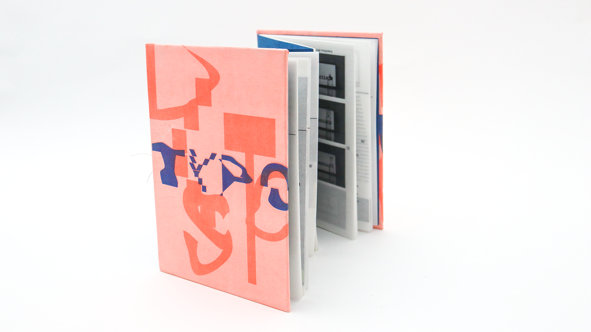
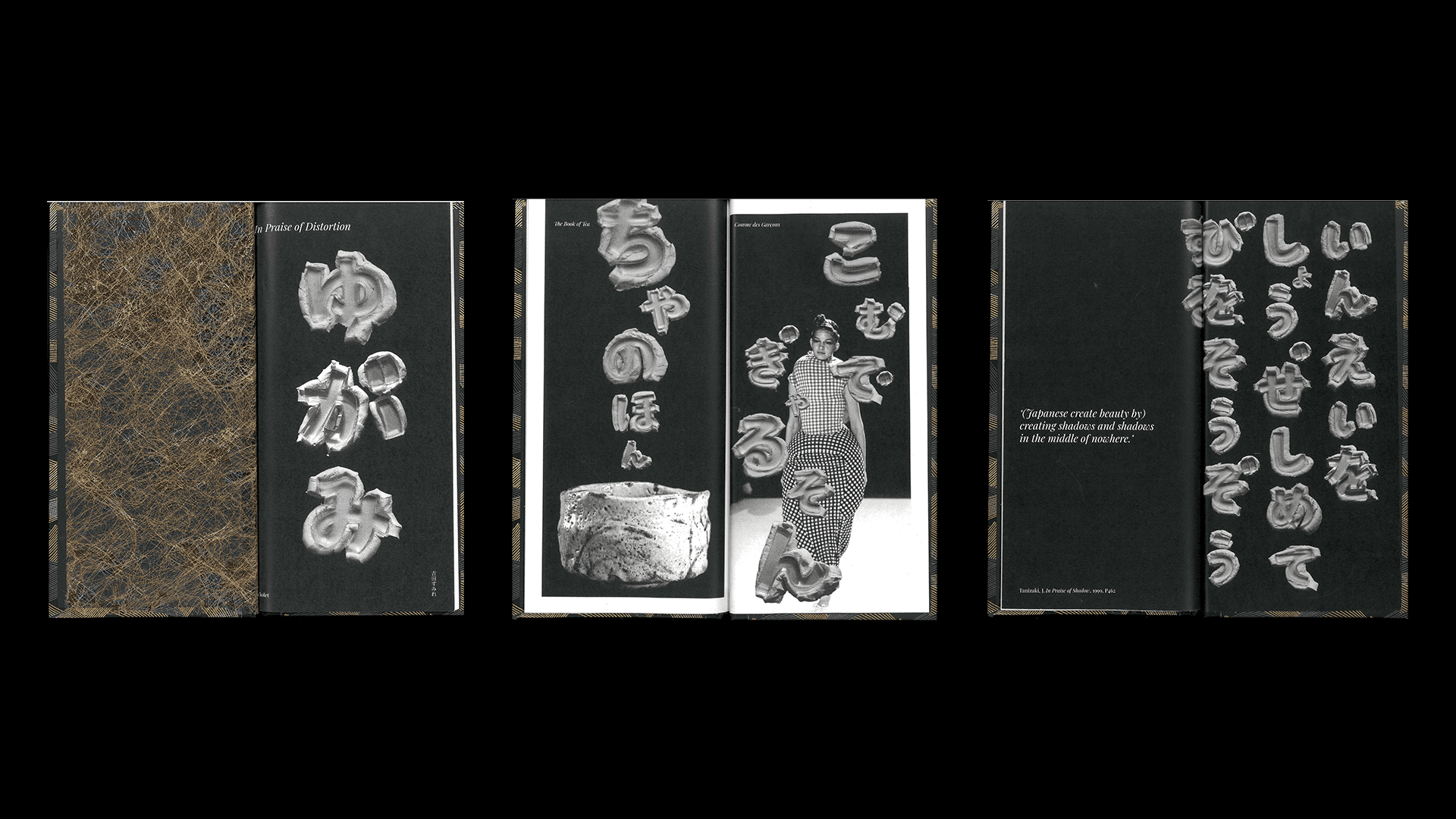
In this project, I delved into the visual effects of ‘distortion’ and explored it within the field of typography. Throughout this journey, I have found an ancient Japanese perspective on 'distortion', in Okakura’s The Book of Tea (1961)# 2. The book introduced me to a Japanese historical appreciation of imperfect beauty. Imperfection in this context includes not only imbalance but also distorted forms (Sueyoshi, 2020, p122)# 3, as can be seen when looking at the Shino Tea Bowl# 4, which is celebrated as a Japanese national treasure. This perspective towards the meaning of distortion inspired me to shape my project.
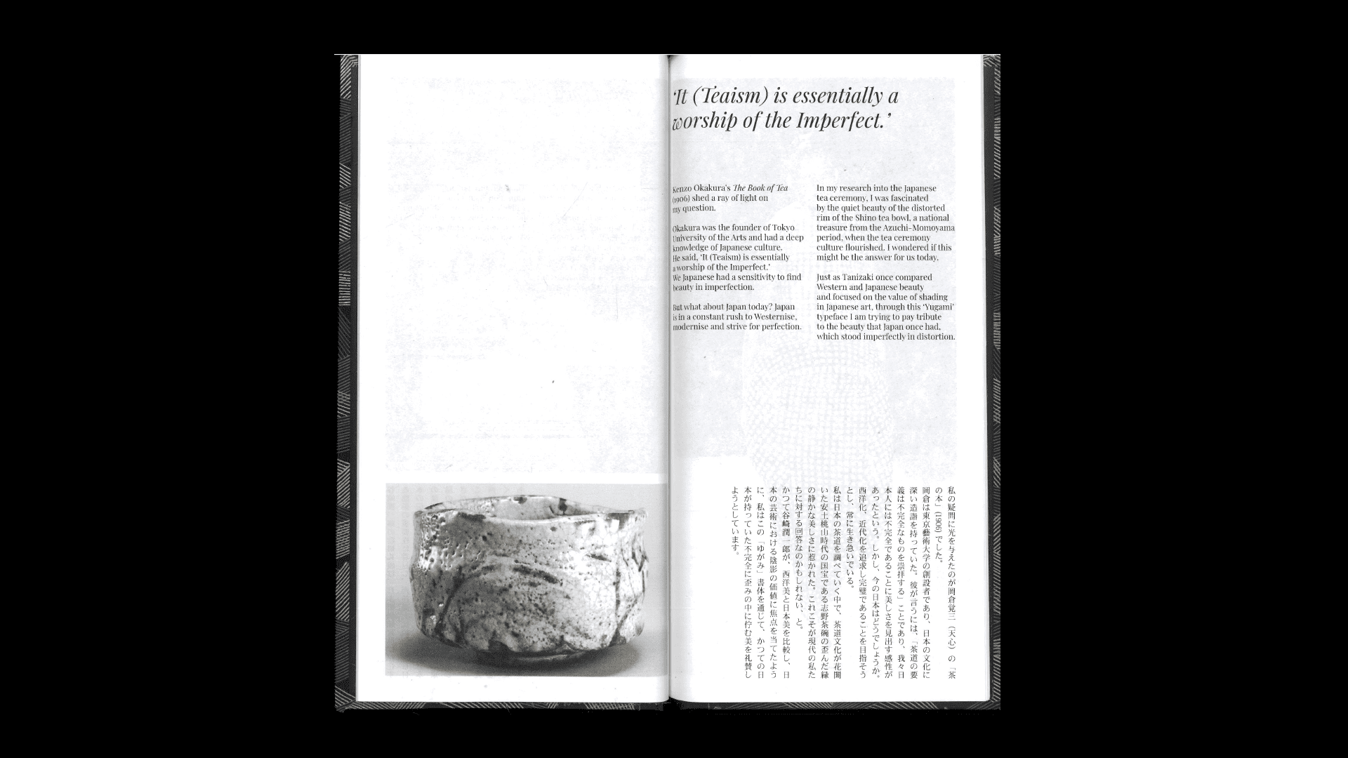
Shino Tea bowl (a page from my publication Yugami type specimen)
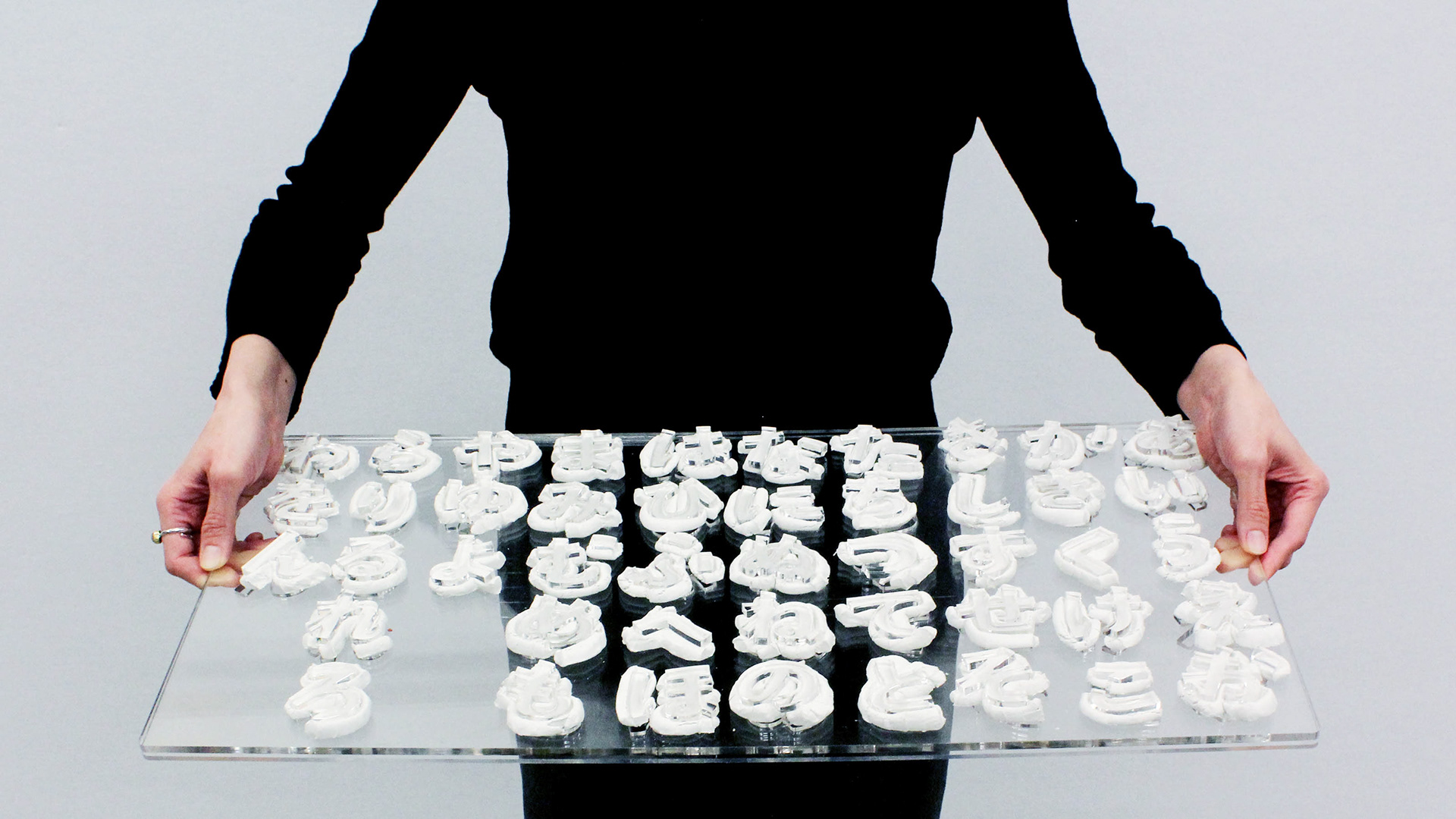
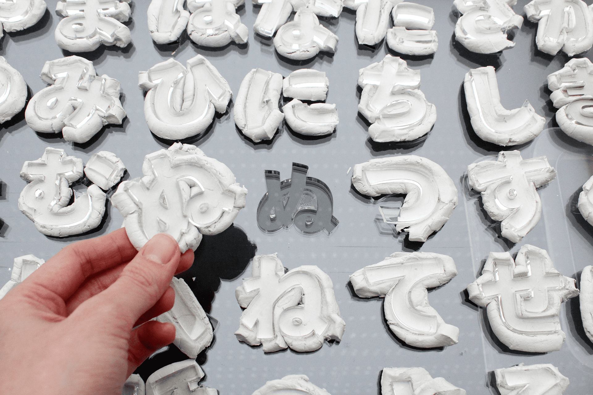
The project seeks to revive Japan's former values for imperfect beauty, particularly the embrace of distortion. In my project, distortion means deviation from the original form or expectation, like the misshapen Japanese Hiragana characters carved in clay reminiscent of Shino Tea bowls.
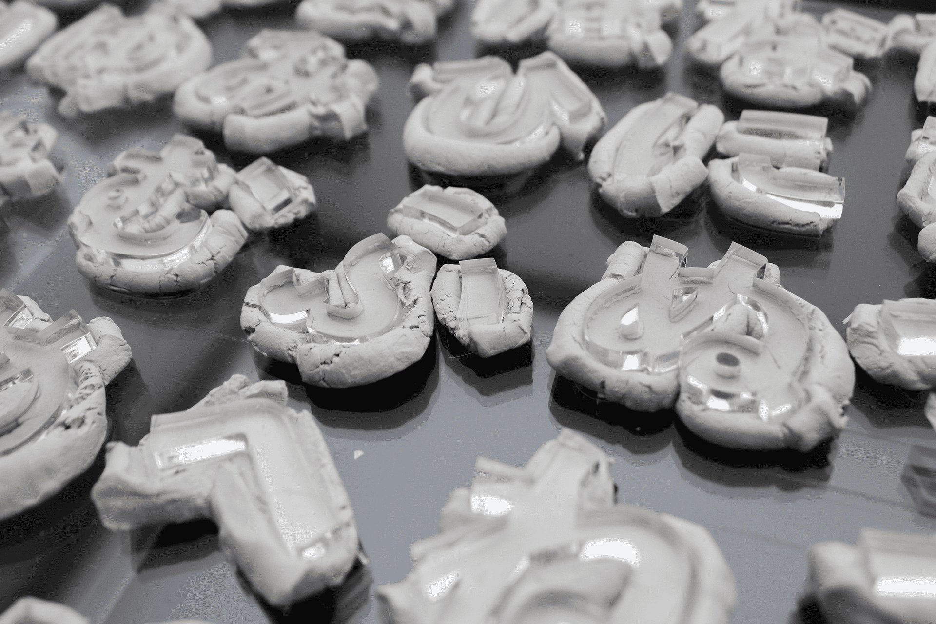
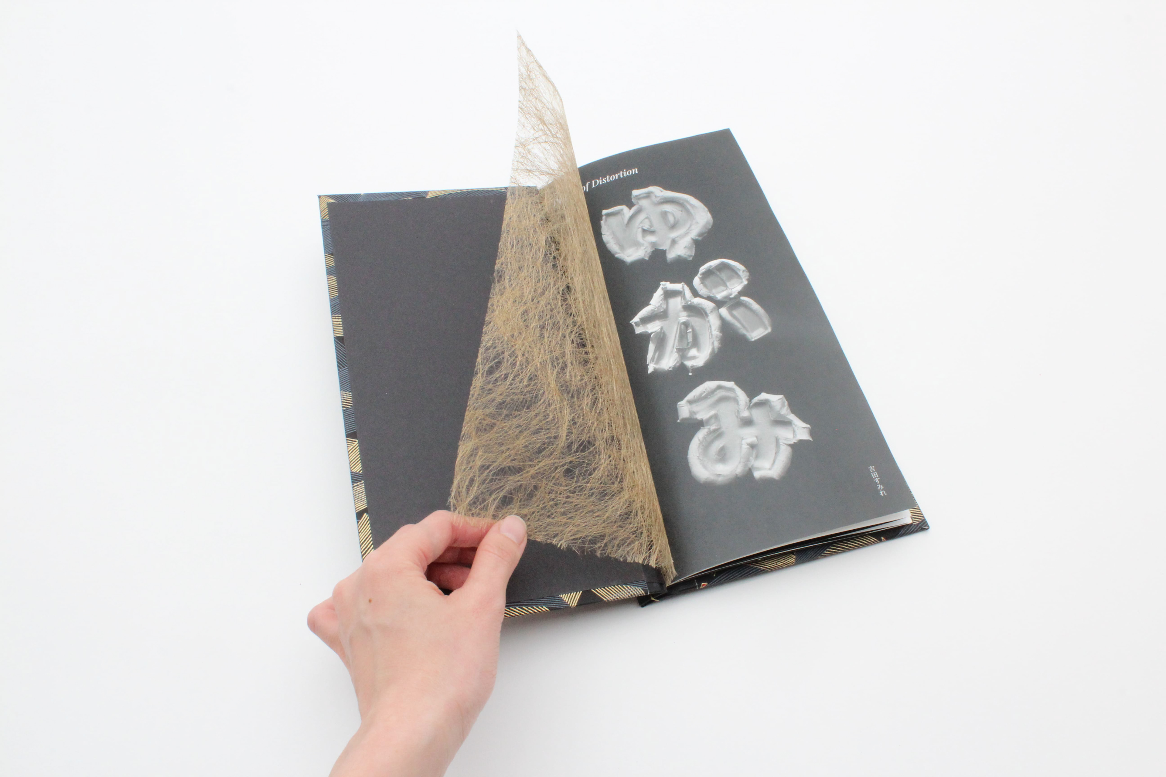
This Yugami (means 'distortion' in Japanese) typeface uses perfectly shaped acrylic moulds to create bumpy, unanticipated type forms. Through this typographic exploration, I celebrate the historical appreciation of distorted beauty in the hope of reintroducing it to modern Japanese society.
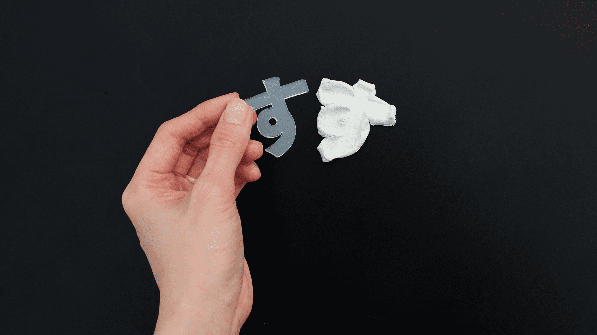
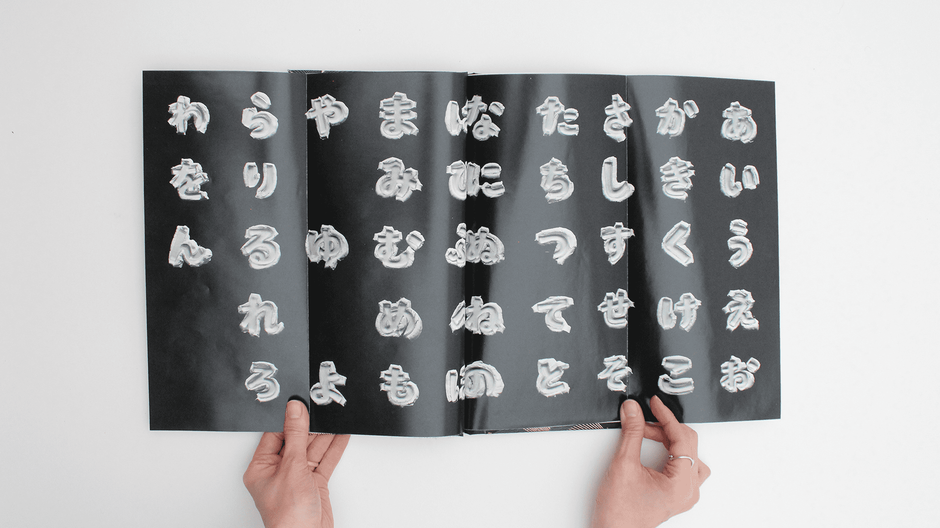
Japanese letters Hiragana in Yugami typeface
Yugami type specimen
Annotated bibliography
1. The 6 dimensions model of national culture by (2016) Geert Hofstede.
2. Okakura K. (1961) The Book of Tea. Iwanami Shoten, Publishers.
3. Sueyoshi, S. (2020) ‘Momoyama tea potteries : The beauty of imperfection', Journal of East Asian cultural interaction studies, 13, pp. 119–136.
4. Tokyo National Museum (2024) Tea bowl, shino type, Mino Ware, Tnm.jp. Available at: https://www.tnm.jp/modules/r_collection/index.php?controller=dtl&colid=G5749&lang=en
Reference
Bing, X. (1994) Square word calligraphy.
Comme des Garçons (1997) Body Meets Dress, Dress Meets Body.
Kurant, A. and Pesko, R. (2020) Emergence Typeface.
Scher, P. (1996a) Bring in ’da Noise, Bring in ’da Funk.
Tanazaki, J. (1999) In praise of shadows. London: Jonathan Cape.
Touli, T. (2023) Reality vs Imagination.
Comme des Garçons (1997) Body Meets Dress, Dress Meets Body.
Kurant, A. and Pesko, R. (2020) Emergence Typeface.
Scher, P. (1996a) Bring in ’da Noise, Bring in ’da Funk.
Tanazaki, J. (1999) In praise of shadows. London: Jonathan Cape.
Touli, T. (2023) Reality vs Imagination.
Central Saint Martins 2024
MA Graphic Communication Design
MA Graphic Communication Design