Poster designs using typefaces I have not worked with before.
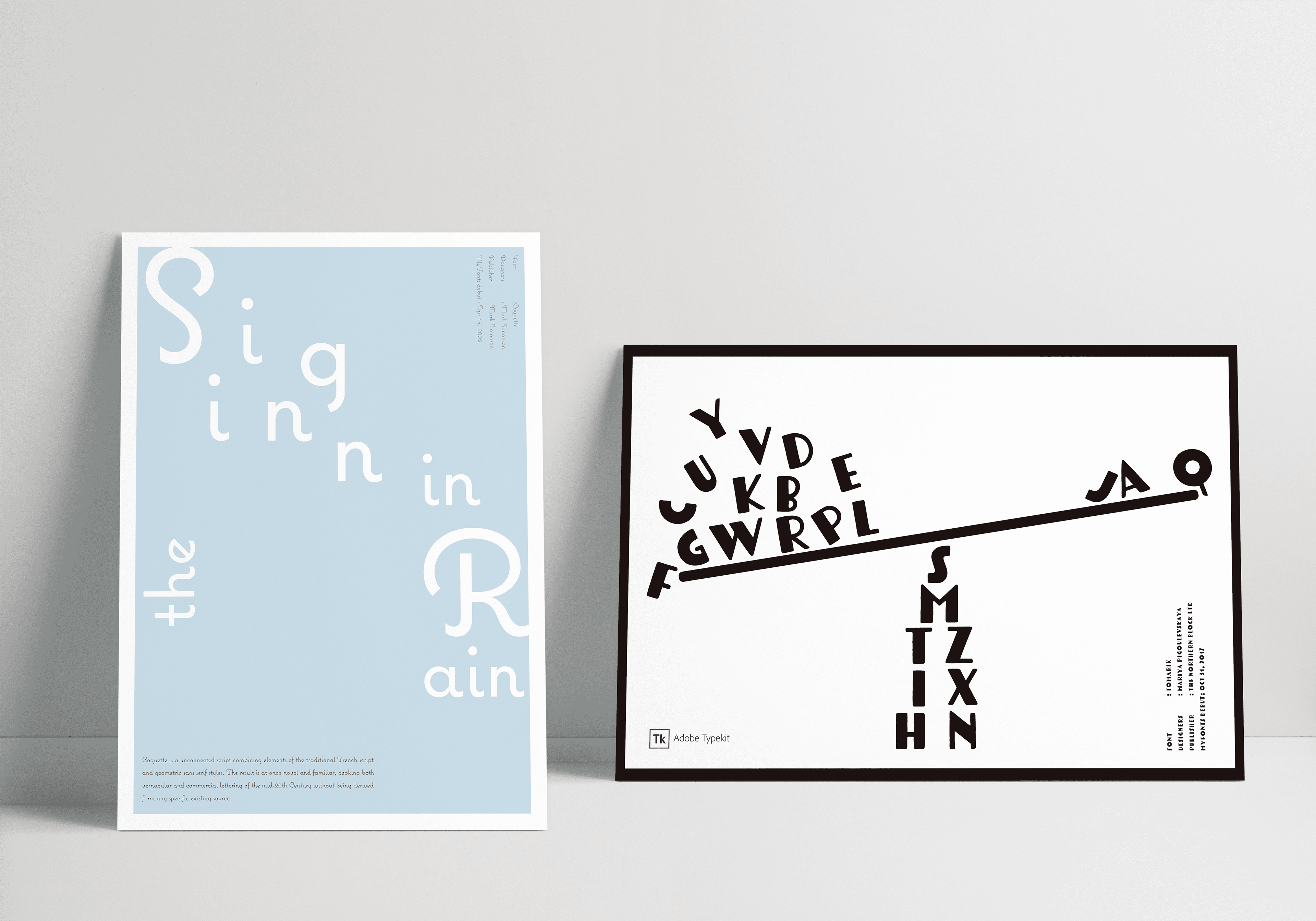
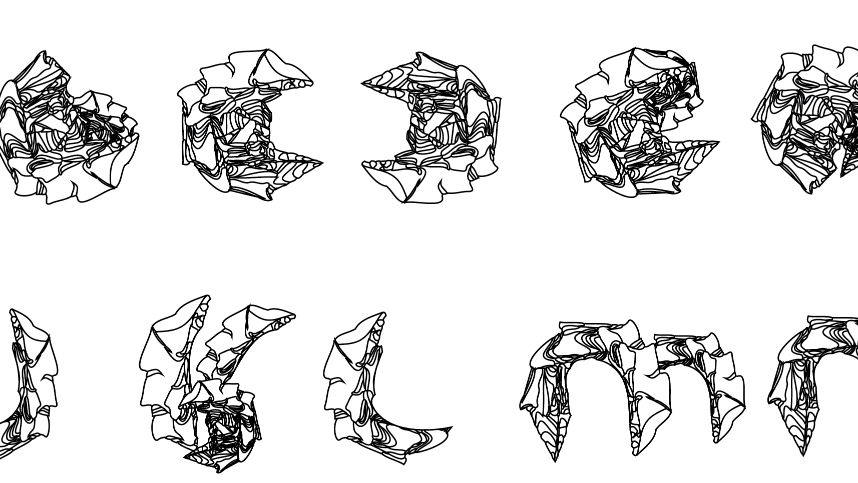
I chose the typefaces Coquette (left) and Tomarik (right).
Coquette, as the name suggests, is a playful, feminine typeface reminiscent of coquettishness, and I created a poster that makes use of the characteristic bouncy strokes.
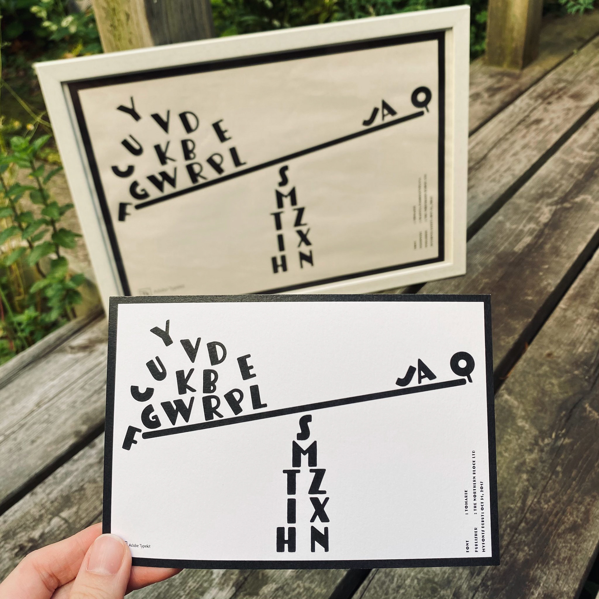
TOMARIK has a prominent thick stem and stroke, so I designed an image that makes use of this.
Now the question. Why is A placed on the right and B on the left in the poster on the right?
Hint: Look at the shape of the letters.
Coquette, as the name suggests, is a playful, feminine typeface reminiscent of coquettishness, and I created a poster that makes use of the characteristic bouncy strokes.
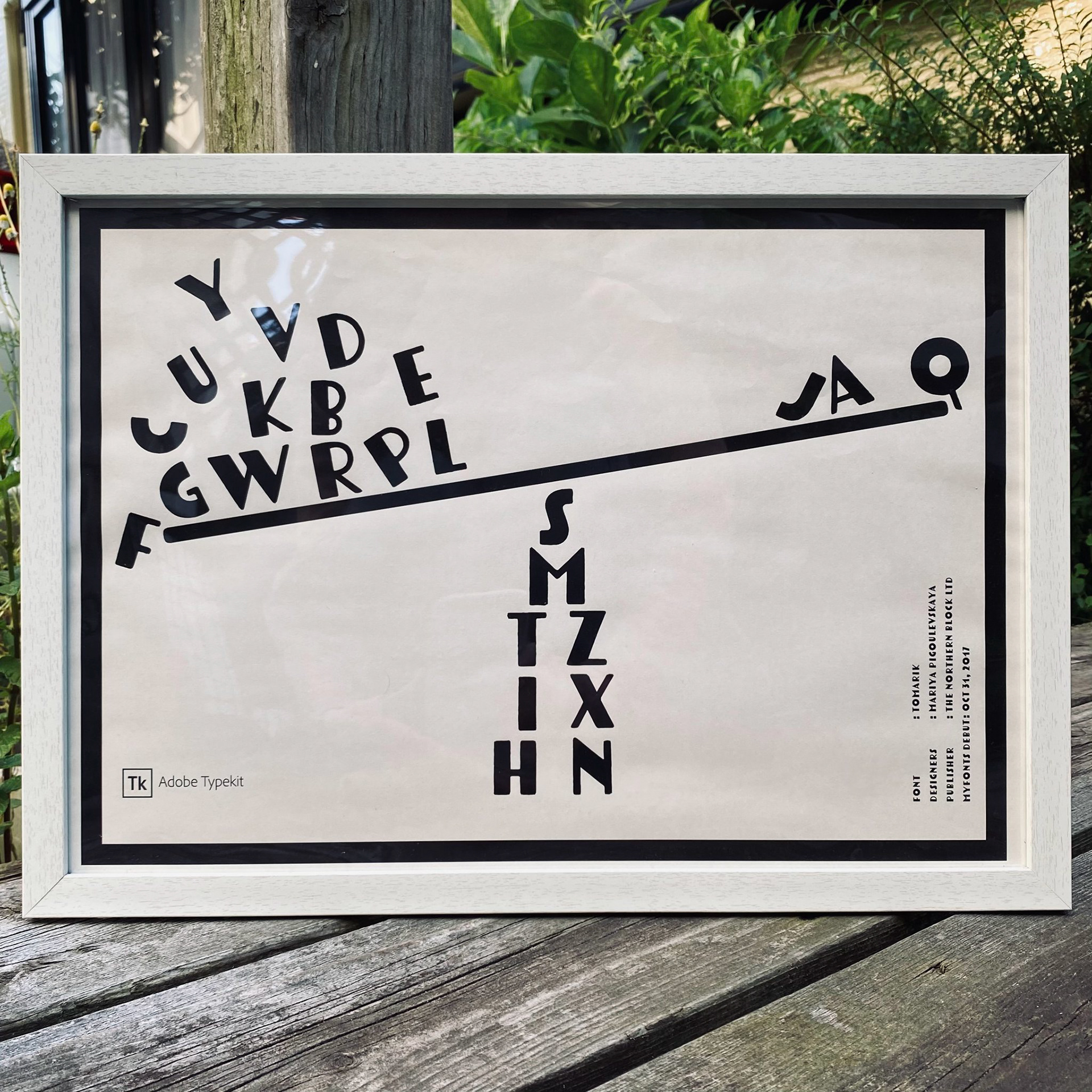
TOMARIK has a prominent thick stem and stroke, so I designed an image that makes use of this.
Now the question. Why is A placed on the right and B on the left in the poster on the right?
Hint: Look at the shape of the letters.
Brief by Tokyo Design Plex Institute